Sunday, March 28, 2010
Final Product
This is the front cover of my newspaper.
This is the second page of my newspaper.
This is the poster for my newspaper.
Friday, March 26, 2010
Images for my coursework production
Above is an image from inside the Liverpool Albert Dock. I have chosen to use this image of the Albert Dock because it shows the Dock from the inside rather than it being a shot of the front of the Dock. There are also boats in the background floating on the water and this is representive of what the Albert Dock is, a port.
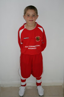
Above is an image of my younger cousin. I shot this picture to use for my sport story/children story. I wanted to represent how young children are able to pursue their dreams even at an early age. I decided to take the image with him standing against a clear, plain canvas because it allowed him to stand out in the picture, leaving the focus on him. The colour red (his football kit) carries connotations of passion and this could be an example of his passion to want to become a professional footballer.
Above is an image of a bin that has been knocked over in a local park. Whereas the colour red can carry connotations of passion, it can also carry connotations of danger and seeing the bin being ripped from the floor is a clear sign of vandalism. The photo was also shot in a park so it is effective because it can draw an emotive response from the reader, particuarly parents, as parks are the type of place they would be taking there children.
Although my newspaper is aimed more at a younger age range I would still be expecting older ages, especially parents from the area to read it.
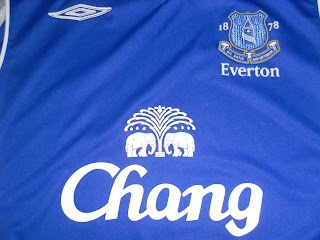
Here I have chosen to use a football badge to represent the clubs. The photo is simple but get to the point of showing that this particular section refers to the team Everton FC.
This is an image I took of a plain white t-shirt. I used photoshop to add on my newspapers logo and the text, "The Liverstop" "Know Your City". I did that as a sort of campaign in which people will see this t-shirt and what it says and become familiar with my newspaper. I have also advertised it in my newspaper by offering it to the winner of a competition.
Sunday, December 27, 2009
Draft Designs for Newspaper
The two images above show the layouts for the design of my newspaper front page and second page. The image on the left is the front cover and will include the title for the newspaper "The Liverstop". I will be using a main image in the centre which will cover the majority of the page because I want this along with the title to be the first thing that my audience will notice. I will also introduce adverts at the bottom of the page. To the right of the image will be a short extract which will explain a brief introduction to my main story. It will then have a .. turn to page 2 where the story will continue. As this is the only story being used on page one it means this design of newspaper has a linear narrative because my newspaper will follow a straightforward pattern. There will be no need for the audience to turn back to page one for any other stories.
The image on the right is a design for page 2 of the newspaper. It will consist of another image relating to the main story and then a larger extract which explains that story in greater detail.
Below this will be two further news stories of a different genre as I want to add variety to my content. These stories will both include a headline and an image relevant to that story.
The two images above show the layouts for the a different design of my newspaper front page and second page. The image on the left is the front cover and will include the title for the newspaper "The Liverstop". I will be using a main image in the centre because I want this along with the title to be the first thing that my audience will notice. I will also introduce adverts at the bottom of the page. Below the main image will be a short extract which will explain a brief introduction to my main story. It will then have a .. turn to page 2 where the story will continue. My audience will be able to switch back from page 2 (after reading the main story) to see what other stories can be read. This will make this design have a complex narrative as the newspaper isn't being read from page one to the end, page by page. The image on the right is a design for page 2 of the newspaper. It will consist of two more images relating to the main story and then a larger extract, this time placed down the right hand side of the page which explains that story in greater detail.
Below this will be a further news story of a different genre as I want to add variety to my content. This story will both include a headline and an image relevant to that story.
None of the images, stories or content from both designs will be used for my final production.
Wednesday, December 9, 2009
Mood Board
This is my mood board that I created to help with the production of my newspaper.
I habe included titles like the facbook, msn and myspace logos because this is a reminder to me that I want to make the title of my newspaper simple but recognisable the way these logos are to their audience. Facebook, myspace and msn are also examples of social networks people would use in there spare time so I want to take ideas from these networks.
I have included images of Everton and Liverpool football club as a reminder to include sport on my front page and as a representive for fans of both teams from the city.
The colour wheel will help me to decide which colours are complimentary to each other and which shouldn't be used together.
Drafted Ideas
This was a design for my newspaper front cover which I drafted on publisher.
I have come to the conclusion that the title "Liverbeat" has more reference to a music magazine than a newspaper so I will be moving away from using this title. The main headline and first stance look effective as they are in big, bold Arial lettering and catch the attention of the audience.
I came to the conclusion that using a main story on the front page along with another side story would be effective rather than bombarding my audience with stories. This gives my audience a variety to read but doesn't overwhelm them with which story to go to first.
The story I have used will not be used in my newspaper as it is a national based story and my newspaper is local. I used this particular story with the picture to get an idea of how the layout of my front page would look.
Wednesday, November 25, 2009
Newspaper Titles
I want to challenge the codes and conventions of a plain newspaper title and make mine look more appealing to the reader.
I have come up with some ideas shown below.
The LiverBeat
Because this title refers to the Beatles I came up with ideas of a music symbol title and other titles to look more retro because of the time the Beatles were first launched.
The LiverStop
I want to go with the theme of Liverpool in the 80s so I have again chosen simple but retro designs for this title.
The Record
I wanted this title to be bolder and bigger because I am referring it to Liverpool being a historical city.
The Liverpool Breeze
Again I wanted to keep the design simple but more chilled out and relaxing to look at.
I feel that the audience will appreciate a different style of font in comparison to traditional fonts used on newspapers and I hope to make it interesting enough that the audience views it before other newspapers.
Analysing Newspapers
These are two examples of two local newspapers that I analysed. They are both from the same newspaper, The Liverpool Echo and are therefore very similar. I have chosen the Liverpool as my main newspaper to analyse as it is the most popular newspaper from my are.
I can see that the title is positioned in the top left hand corner along with the price and date and e-mail address.
This is a code and convention that im going to conform to because it is found with the majority of newspapers whether tabloid, local or national. Both have a main headline and this is recognisable through the big bold font however the newspaper on the left doesn't have a first stance like the one on the right. I will be using a first stance for my newspaper.
Both have other insert stories positioned above the main story. These stories vary in genre and this is important for a newspaper, to have variety. The genres include crime, sport, music and politics.
It is also noticeable that both of these newspapers have adverts at the bottom of their newspapers and this seems to be a code and convention with most local newspapers I have looked at but I am going to challenge this code and convention by not having adverts on my front cover.
Both newspapers also include a byline, which gives the name and sometimes the position of the writer for that particular story and I will also be doing this for my newspaper.
I will be taking ideas from my main newspaper I am analysing (Liverpool Echo) but add my own ideas to make my newspaper original.
Subscribe to:
Posts (Atom)